Full Strength Appraisal
My Festival Poster “Full Strength” it created to capture the essence of a free spirit. I wanted to do something funky with it.
The use of line is apparent throughout my design. A great deal of it in the image and surrounding effects. It holds the main piece together, mostly the line work is quite intricate, but also there is parts in the design that aren’t so busy, giving it all a slightly more relaxed feel.
I didn’t want to cover the entire field, as I hate busy pictures. I much prefer the simplistic strait forward approach. I think it looks cleaner and more elegant.
I made sure my image defiantly had some contrast this is shown through my Typeface in relation to the image. As the image is quite soft I wanted the type to stand out from it.
The shape overall has become quite interesting and all seems to gather on one side of the page. This is good because it leaves a nice amount of negative space. The individual shapes throughout all have different uses, such as the splash in the bottom right corner. I created this shape specifically to place type into.
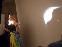
My colour scheme actually stemmed directly from my model. She has a patch of bright red hair. I used this as a base for the entire image. I then just used a few different shades of that same colour. The other thing I did consider is that it is for a Punk/Pop festival, so the red suited that theme quite well.
My texture for the girl was created in the Filter Gallery I used fresco. I used this because it gave my model a more ghostly and unrecognizable look, but also retained the vibrant colour in her hair and also her arms.
The Rose also creates texture. This is because each layer is slightly opaque, meaning the layer underneath can be seen which gives the illusion of texture.
I think this has been quite a successful process and has come back with the results I was hoping for.
Tuesday, August 11, 2009
Subscribe to:
Post Comments (Atom)

No comments:
Post a Comment