Monday, August 31, 2009
Tuesday, August 25, 2009


Tuesday, August 18, 2009


Tuesday, August 11, 2009
Full Strength Appraisal
Full Strength Appraisal
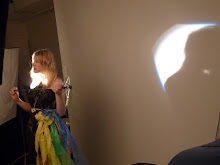
My Festival Poster “Full Strength” it created to capture the essence of a free spirit. I wanted to do something funky with it.
The use of line is apparent throughout my design. A great deal of it in the image and surrounding effects. It holds the main piece together, mostly the line work is quite intricate, but also there is parts in the design that aren’t so busy, giving it all a slightly more relaxed feel.
I didn’t want to cover the entire field, as I hate busy pictures. I much prefer the simplistic strait forward approach. I think it looks cleaner and more elegant.
I made sure my image defiantly had some contrast this is shown through my Typeface in relation to the image. As the image is quite soft I wanted the type to stand out from it.
The shape overall has become quite interesting and all seems to gather on one side of the page. This is good because it leaves a nice amount of negative space. The individual shapes throughout all have different uses, such as the splash in the bottom right corner. I created this shape specifically to place type into.
My colour scheme actually stemmed directly from my model. She has a patch of bright red hair. I used this as a base for the entire image. I then just used a few different shades of that same colour. The other thing I did consider is that it is for a Punk/Pop festival, so the red suited that theme quite well.
My texture for the girl was created in the Filter Gallery I used fresco. I used this because it gave my model a more ghostly and unrecognizable look, but also retained the vibrant colour in her hair and also her arms.
The Rose also creates texture. This is because each layer is slightly opaque, meaning the layer underneath can be seen which gives the illusion of texture.
I think this has been quite a successful process and has come back with the results I was hoping for.

Art Nouveau
 I love this water jug! It's a french piece and again it has very flowing design which seems to be the french style. The colour is amazing, much brighter than other Art neaveau pieces i've seen.
  This is a Scottish example of Art Neaveau satuary. Typically detialed and elegant. Lots of line and shape being used to portray the womans skirt.
  This is a very simplistic example of Art Neaveau. It's a small French stool, not as decorative as most French pieces but i think it has a lot of character in the smooth elegant lines.
 This is in the most traditional french style of Art Nouveau similar or perhaps inspired by Alphonse Mucha works. All the lines are very flowing with a lot of block colours, which gives a simple stylish feel.
 This piece is also french and as i understand quite a famous bit of Art Neaveau. Again it has the flowing line maybe not so much as the previous piece, but still a large factor.


About my Festival
Music Festival Poster
About the festival
My Festival ‘Full Strength’ is going to be a Punk/Pop festival, for the Melbourne Pop, Punk population.
It is a weekend festival held over two nights, giving the daytime hours to recover for the next night. It is held in late October when everything is starting to warm up again.
The Festival is aimed at the younger rocking generation; say the sixteen to thirty year olds, this is also a non-alcoholic event (free water provided) we find people go crazy all by themselves.
The atmosphere is very full on and sometimes exhausting, so several rooms have been made available for people to wind down and chill out if it all gets too much.
In addition to the music we also have fire dancing and free juggling classes happening around the festival.
The event is held in the MCG as it has a large amount of space to cram everyone into. Also having the festival here doesn’t disturb local residents, as it tends to get a bit noisy.
Buses and trains are an easily accessible and convenient way to get to and from the festival.
First Aid on site.
Tuesday, August 4, 2009
Research for Festival Poster- Negative space
 How is the design concept used?
The dark of the Negative space is i think designed to pull out the other colours, which makes the image very eye catching. It's a very simple design but says exactly what it wants to.
Comment on line,shape,texture and colour.
The main use of line is in the typography which has become the main focus of the poster. Which is good because it grabs the attention and brings the eye down to the vacuum cleaner itself.
Again the shape is in the type, this typeface is very cool and ads to the design.
I'm not sure that there's much texture in this although it appears very smooth and clean. Perhaps this was intentional to get people to try and picture the vacuum as being a smooth machine?
Colour plays a big part of this design. It brings out the entire image, also gives the negative space.
What do i like about the image?
I love the typeface it's very funky.
How will it influence my poster?
Try to use colour to bring out my image.

How is the design concept used?
I think the use of negative space here is quite subtle. It's not designed to take any focus or push anything out. The image and text stand well on their own. The negative space just gives a nice amount of breathing space around the image.
Comment on line,shape,texture and colour.
Line in this image is jagged in most places which gives a kind of uniformity to the image.
Shape here is quite dominant, as the picture is entirely made up of different shapes it becomes an important element.
Texture is not so obvious but i think it may have been meant to have a smooth, cool texture. To express the night sky.
In the way of colour this image has a very simple palette which i think works well in the idea of a night time sky. It's more of a calming colour though, instead of using a harsh black which would create tension for the sky.
What do i like about the image?
I like the symmetry of this image
How will it influence my poster?
Perhaps to use different shapes to create my image

How is the design concept used?
This is a very clever use of negative space, in fact it's hard to tell which is supposed to be the focal area as they work so harmoniously together. This image draws the attention right away. I first noticed the hand in this, before noticing the legs.
Comment on line,shape,texture and colour.
There really isn't much line to this as shape is much more prominent to create the image. It's been constructed in a very interesting way so the shapes look like a hand and legs.
I don't see any texture in this.
The colour is very contrasting which makes the images stand out really well.
What do i like about the image?
I love how you have to do a double take of this image to understand it.
How will it influence my poster?
I'm not to sure if i can be that clever but i'll try!

How is the design concept used?
This is again using the negative space very cleverly, but this one only have one image created in the space. It looks like the red paint has been embossed slightly to bring out the red and make it look like blood, it's very effective.
Comment on line,shape,texture and colour.
I think line and shape are mixed in together here. The edge of the red has a very definite line, it also has a definite shape. with the use of line marking out where the shape should be.
There seems to be a slight gradient over the embossing which helps gives the illusion of blood.
Colour is very important in this image. With the red being blood, but also the black makes everything seem very dark and evil.
What do i like about the image?
I love how the blood actually does look like blood. It takes a moment to recognise the image.
How will it influence my poster?
I may use a shape to create another underlying shape. it's an interesting idea.
Research for Festival Poster- contrast
Good examples of contrast
 How is the design concept used?
I think what this designer is trying to do is create a focus on the car without overcrowding the image. The contrast here i think is the use of the photography with the digital. Created with the use of colour, texture, line and shape.It seems to look like the colour has been used to create the road that the car is driving upon.
Comment on line,shape,texture and colour.
Line is quite prominent in this image. It creates a very streamline feeling, like the image is very fast. This works well with its subject.
The block shapes that have been created again creates the feeling of speed, or a road on which the car is driving.
The texture here Gives the illusion that the road is wet, it looks like its just had a few white lines painted onto the road to give that effect.
The colour really grabs your attention, also it helps to create a more digital feel from the photographic element. This gives the contrast in the image.
What do i like about the image?
I like the simplicity, with more designs i'm attracted to the image isn't busy. I like how the lines and shapes are quite simple, but they seem elegant. Also i love the feeling that the poster is fast like the car.
How will it influence my poster?
I think i'm going to try to incorporate that illusion of feeling something, i know this car is fast just the by looking at the image.
 How is the design concept used?
This poster portrays a great mysterious feel. The tall dark stranger, but also has a comical side as our stranger has a large glass of wine in his hand. The contrast in this scene is the dark and light, but interestingly the main figure is the dark.
Comment on line,shape,texture and colour.
The lines in this are quite flowing and simple indicating this guy might be a swarve, confident man.
There's a big block of shape in this to indicate the the man. I think it's a very effective way to show a character simply.
There seems to be a lot of texture in the background, it's sort of a haze which brings out some more of the mystery.
The colours in the background in this are actually quite bright, with the Central figure being dark. This is what is giving its contrast.
What do i like about the image?
Again i love the simplicity. But also the hint of the comical is very effective.
How will it influence my poster?
Perhaps adding a subtle use of humor...
 How is the design concept used?
With the use of a soft image with a hard, sharp title we have the contrast. I think this gives this a modern edge. This is quite important for this image to do because the picture itself looks older and perhaps outdated. The boldness of the title really ties it well to the present.
Comment on line,shape,texture and colour.
Most of the lines in this image are quite simple, except for the fruit bowl which is a complex unison of lines.
Apart from the fruit, all the shapes are square. This i think ads to the titles hardness which really helps push the focus to the fruit.
The texture here is in the fruit itself i think this makes it look more real.
The yellow colour pushes everything top the front and accentuates the blacks. Also gives more emphasis on the individual fruit.
What do i like about the image?
I love how the pushes the image forward.
How will it influence my poster?
Using colour to emphasis things?
 How is the design concept used?
There's a sharp difference between the line complexity from simple to intricate giving it contrast. I think this is a book festival or a learning center. I can't actually understand the language, it's the feel and simplicity of the image that can tell you what it's about, this makes it much more universal.
Comment on line,shape,texture and colour.
As i said previously there is a great difference in the line complexity in this image. It gives the sense that the brain is a muddled, busy part of the human being.
Shape is used to create some of the simpler parts of the body here, this ads to the contrast.
The texture is more in the hair/head of the girl. It brings out the depths in the leaves and the owl.
This colour scheme i think is very good as a first glance it really catches your attention to the poster and is and interesting point in the poster.
What do i like about the image?
I love how its put simplicity and complexity all on the same poster. It gels really wells together.
How will it influence my poster?
maybe to use simpler elements to help accentuate the more complex elements.


 How is the design concept used?
I think what this designer is trying to do is create a focus on the car without overcrowding the image. The contrast here i think is the use of the photography with the digital. Created with the use of colour, texture, line and shape.It seems to look like the colour has been used to create the road that the car is driving upon.
Comment on line,shape,texture and colour.
Line is quite prominent in this image. It creates a very streamline feeling, like the image is very fast. This works well with its subject.
The block shapes that have been created again creates the feeling of speed, or a road on which the car is driving.
The texture here Gives the illusion that the road is wet, it looks like its just had a few white lines painted onto the road to give that effect.
The colour really grabs your attention, also it helps to create a more digital feel from the photographic element. This gives the contrast in the image.
What do i like about the image?
I like the simplicity, with more designs i'm attracted to the image isn't busy. I like how the lines and shapes are quite simple, but they seem elegant. Also i love the feeling that the poster is fast like the car.
How will it influence my poster?
I think i'm going to try to incorporate that illusion of feeling something, i know this car is fast just the by looking at the image.
 How is the design concept used?
This poster portrays a great mysterious feel. The tall dark stranger, but also has a comical side as our stranger has a large glass of wine in his hand. The contrast in this scene is the dark and light, but interestingly the main figure is the dark.
Comment on line,shape,texture and colour.
The lines in this are quite flowing and simple indicating this guy might be a swarve, confident man.
There's a big block of shape in this to indicate the the man. I think it's a very effective way to show a character simply.
There seems to be a lot of texture in the background, it's sort of a haze which brings out some more of the mystery.
The colours in the background in this are actually quite bright, with the Central figure being dark. This is what is giving its contrast.
What do i like about the image?
Again i love the simplicity. But also the hint of the comical is very effective.
How will it influence my poster?
Perhaps adding a subtle use of humor...
 How is the design concept used?
With the use of a soft image with a hard, sharp title we have the contrast. I think this gives this a modern edge. This is quite important for this image to do because the picture itself looks older and perhaps outdated. The boldness of the title really ties it well to the present.
Comment on line,shape,texture and colour.
Most of the lines in this image are quite simple, except for the fruit bowl which is a complex unison of lines.
Apart from the fruit, all the shapes are square. This i think ads to the titles hardness which really helps push the focus to the fruit.
The texture here is in the fruit itself i think this makes it look more real.
The yellow colour pushes everything top the front and accentuates the blacks. Also gives more emphasis on the individual fruit.
What do i like about the image?
I love how the pushes the image forward.
How will it influence my poster?
Using colour to emphasis things?
 How is the design concept used?
There's a sharp difference between the line complexity from simple to intricate giving it contrast. I think this is a book festival or a learning center. I can't actually understand the language, it's the feel and simplicity of the image that can tell you what it's about, this makes it much more universal.
Comment on line,shape,texture and colour.
As i said previously there is a great difference in the line complexity in this image. It gives the sense that the brain is a muddled, busy part of the human being.
Shape is used to create some of the simpler parts of the body here, this ads to the contrast.
The texture is more in the hair/head of the girl. It brings out the depths in the leaves and the owl.
This colour scheme i think is very good as a first glance it really catches your attention to the poster and is and interesting point in the poster.
What do i like about the image?
I love how its put simplicity and complexity all on the same poster. It gels really wells together.
How will it influence my poster?
maybe to use simpler elements to help accentuate the more complex elements.
Subscribe to:
Posts (Atom)